Homework chart(s) 1: Setting up our GitHub website and embedding 3 charts from the repository: 'RDEconomist'.
Homework chart(s) 2: Embedding 2 charts; 1 from a given API, and one from a related CSV.
Homework chart(s) 3: Recoding a chart from the first week by manually typing key-value pairs.
Homework chart(s) 4: Making an alteration to a CSV file to embed a different chart.
Homework chart(s) 5: Embedding 2 charts, each from a different API of our choice.
Homework chart(s) 6: Uploading 4 related charts after using a Python loop to batch-download JSON files.
Homework chart(s) 7: Scraping a data-table online and embedding a chart from it.
Homework chart(s) 8: Creating a chart that supports/refutes an argument made by a 'Talking Economics' panelist.
During the second 'Talking Economics' panel (17/11/21), Graeme Roy of the University of Glasgow claimed 50% of households that are in poverty in Scotland are working households. Despite his main point still holding, the recent figures are actually worse, as illustrated below. 50% was the rough figure at the beginning of the millenium, but this has crept up to a percentage in the mid to high sixties in recent averages. This is likely a result of real wages stagnating across the country.
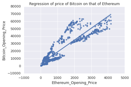
Homework chart(s) 9: Joining datasets and performing a Seaborn regression in Python.
This specific regression plot has an R-squared value of 0.84, and has a linear predictive equation of Bitcoin_opening_price = 15.86*Ethereum_Opening_Price + 3118.04 [I wanted to add both of these pieces of information onto my graph; however, I only found how to do this in Vega not Python]
Homework chart(s) 10: Embedding a chart that incorporates some form of interactivity.